Part&Parcel Magazine
Timeline
3 months
Our Goal Develop an app that facilitates connections among Part&Parcel's readers and enables ongoing engagement between magazine releases. This platform will serve as a conduit for fostering community interaction among users and strengthening connections between readers and Part&Parcel.
My Role Lead Designer, working with Part&Parcel’s Community Director
Our Problem
Part&Parcel values community, connection, and Biblical hospitality, However, their existing social media platforms lacked meaningful avenues for reader interaction and community engagement.
The website had a beautiful and user-friendly interface; however, it lacked effective channels for fostering connections between the team and readers, as well as among readers themselves. Moreover, a significant majority (63%) of users who had a mobile app installed on their devices expressed a preference for using it over the website for making purchases. This suggests that Part&Parcel was missing out on sales opportunities.
We set out to fix that.
We asked two questions:
What is a barrier to engaging with your neighbors?
How could an app help encourage you?
What They Said:
We categorized the feedback.
Next, we prioritized the end users’ needs and planned our MVP.
Our User Personas
-

Steve Marsh
PASTOR
“I need a resource that encourages people to love like Jesus did. They just don’t want to leave their comfort zone.”
-

Monet Goode
WIFE / MOTHER
“I want to be a light in my neighborhood, but with the busyness of taking care of the kids and the house, it’s hard to fit one more thing in. Make it easy for me!”
-

Eleanor Parks
SINGLE / PROFESSIONAL
“I want to share Jesus, but how do I build genuine relationships with those I work with?”
Our minimal viable product would focus on connection: connecting the business with the readers and the readers with each other.
Upon reviewing the survey data, we identified discrepancies in our initial site map priorities. We revised the plan, removing sections like Recipes and Guestbook, which were more focused on hosting and less useful to readers without prior connections. Instead, we introduced new sections such as Challenge and Educate, addressing the readers' desire to connect and their challenges in doing so effectively.
Time to start drawing.
How might we facilitate immediate connections? We initiated the process by sketching wireframes on paper. Upon logging in, we wanted to present users with immediate options for connecting with each other. Subscribing to the magazine became a secondary consideration, emphasizing user-to-user interactions as the foremost objective.
Paper >>> Digital
After digitizing our preferred paper prototypes, we transitioned to creating wireframes using Figma. To align with our priority of emphasizing connection, we focused on refining the home page layout. Among the options, we chose the design on the far right. This design featured connection elements above the fold and maintained a clean aesthetic consistent with the magazine's branding.
Our First Round of Testing
-

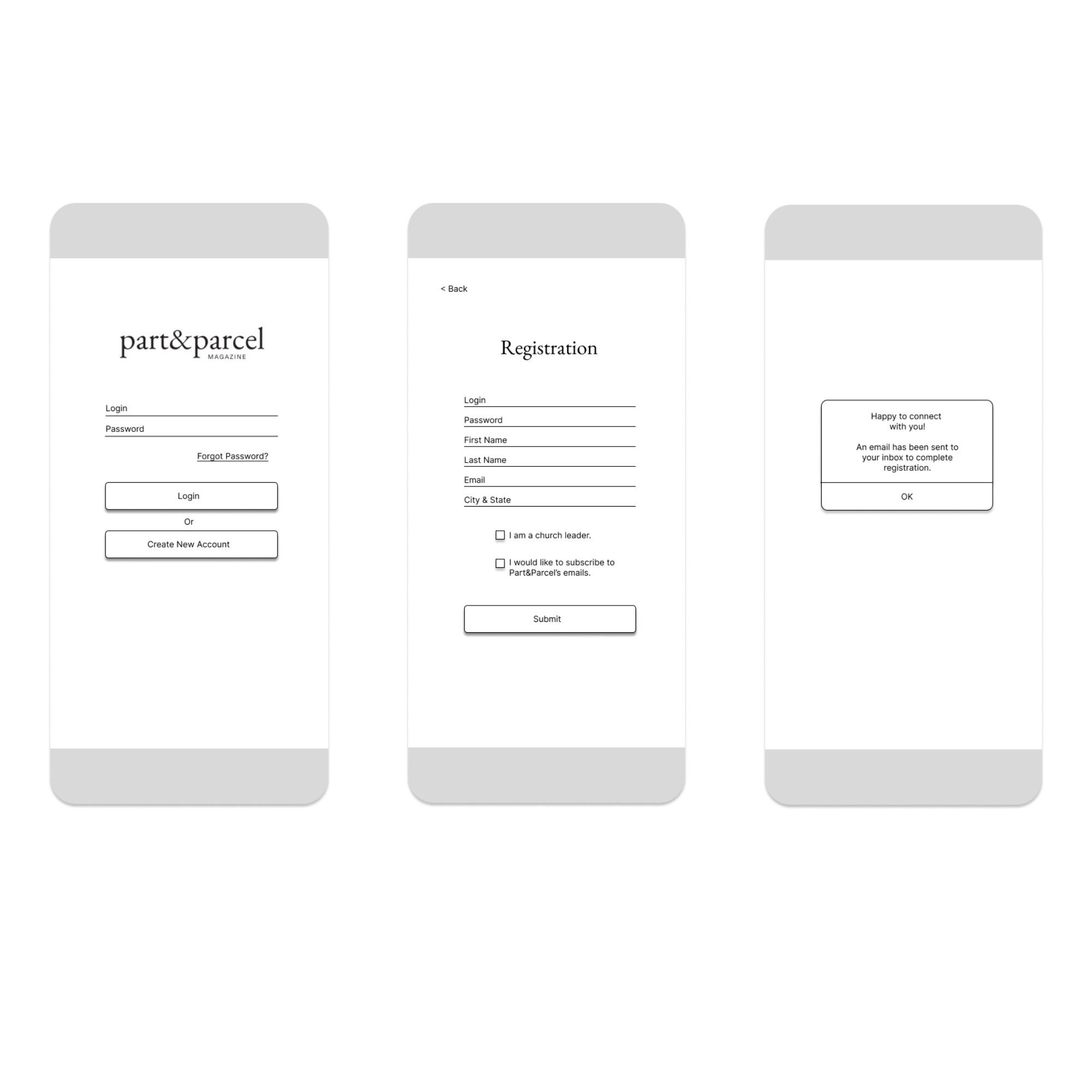
Task: Register a New Account
Can the user easily register for a new account?
-

Task: Join a Conversation
Can the user join a conversation, read the question, and reply?
During the moderated usability test using our low-fidelity prototype, our four participants offered helpful feedback.
Task: Register a New Account
“The registration process was easy, but the app was boring looking.”
Participant A
“Am I choosing between being a church leader or wanting their emails? That wording is confusing.”
Participant B
“That was easy.”
Participant C
“Why do I have to choose between those two (church leader box or email box)? That’s weird. I’m not either one.”
Participant D
Task: Join a Conversation
“I love it that I can skim the questions and find what I’m most interested in.”
Participant A
“I would want to privately DM someone if the question was sensitive.”
Participant B
“Will the questions be moderated?"
Participant C
“OK. Done.”
Participant D
…Which led to a few design changes.
We clarified the wording on the check boxes at the end of the registration process and added an on-brand background image for visual interest.
Design Guidelines for Part&Parcel App
The team plans to conduct usability studies on the Join a Project section and make necessary adjustments based on findings.
Before, during, and after the launch of Part&Parcel’s app, the team will execute an email campaign for awareness. Additionally, individual emails will be sent to church leaders once their contact information is captured during the registration process.
The app will include a five-star rating survey with optional comment fields for users to provide feedback.
One month post-launch, the team will convene to review feedback and strategize for the first update.


